01The ideaTamashi
Tamashi is Japanese for soul. The mark had to carry one.
The drawing follows the way Japanese characters are drawn. The letters were made for it too: the A takes the shape of the fox's ears.
- 01Fox ears, mountainsKitsune, Japan's spirit animal, and the country's mountains, in one outline.
- 02The sun, the rollThe red sun of the flag, set like a sushi roll after the cut.
- 03A hidden sceneSeen from above: the hat of a farmer rowing home.
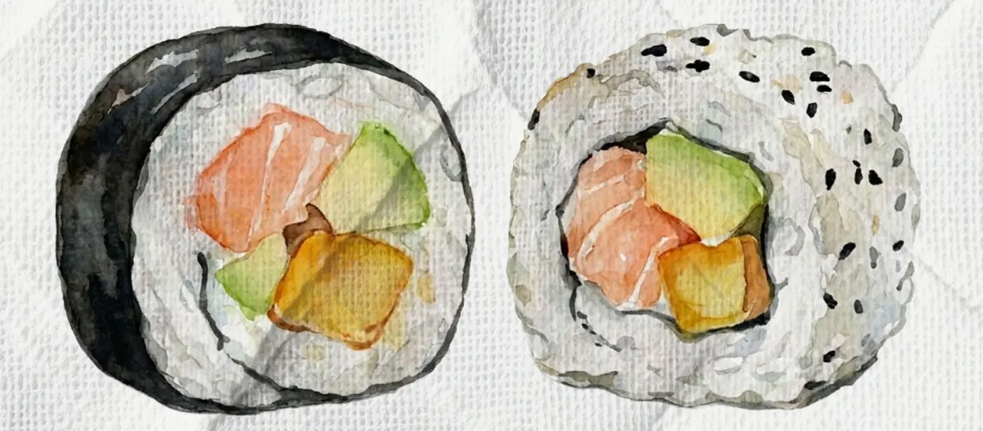
02The logoTamashi
Black, red and white, nothing else. Red is scarce: the sun and the kanji 魂.



03ColourTamashi
Black#000000The mark
Red#DD1000Sun and kanji
Grey#D6D6D6Quiet version
Fabric white#F6F5F3Posts and print
04TypeTamashi
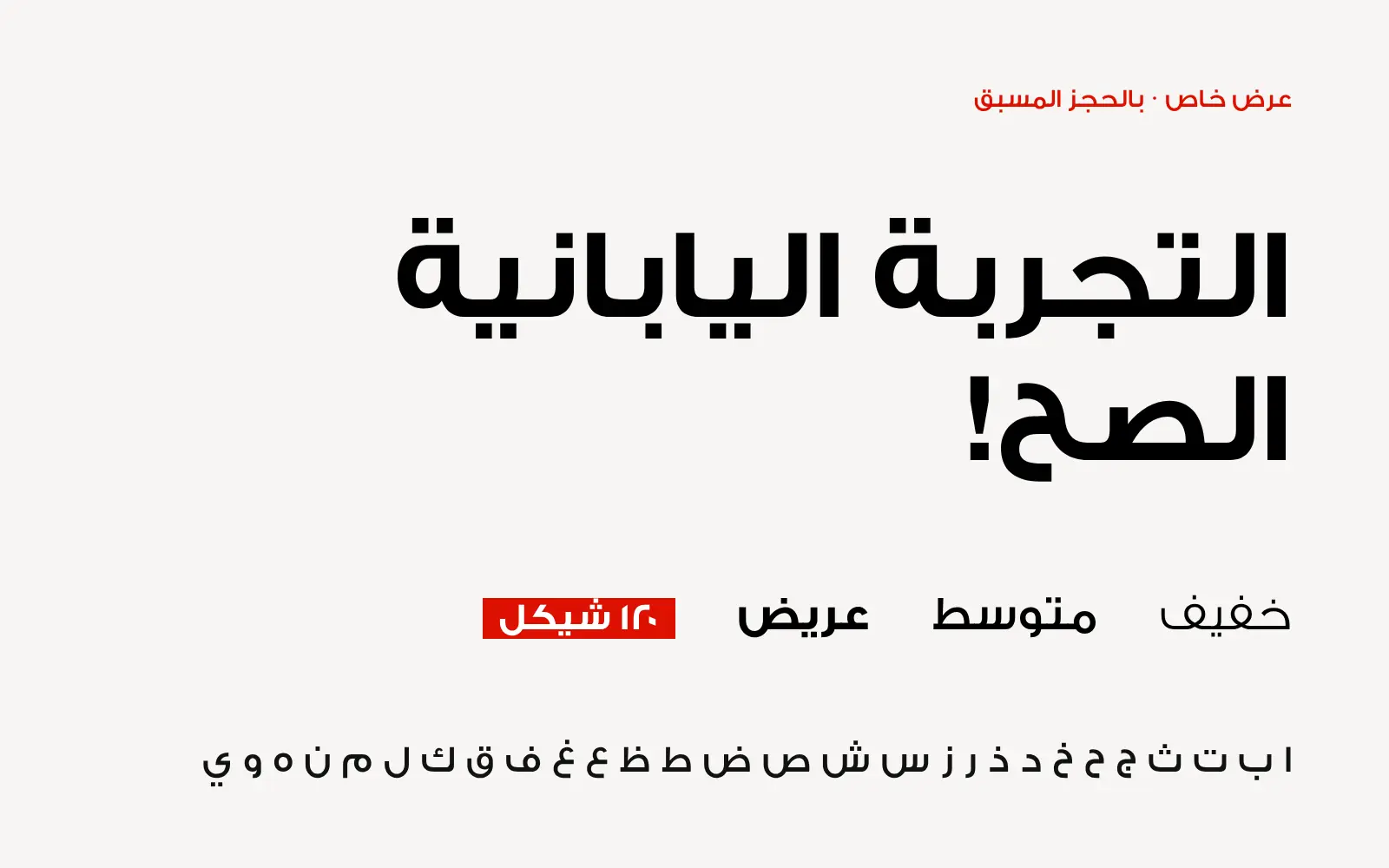
05In useTamashi
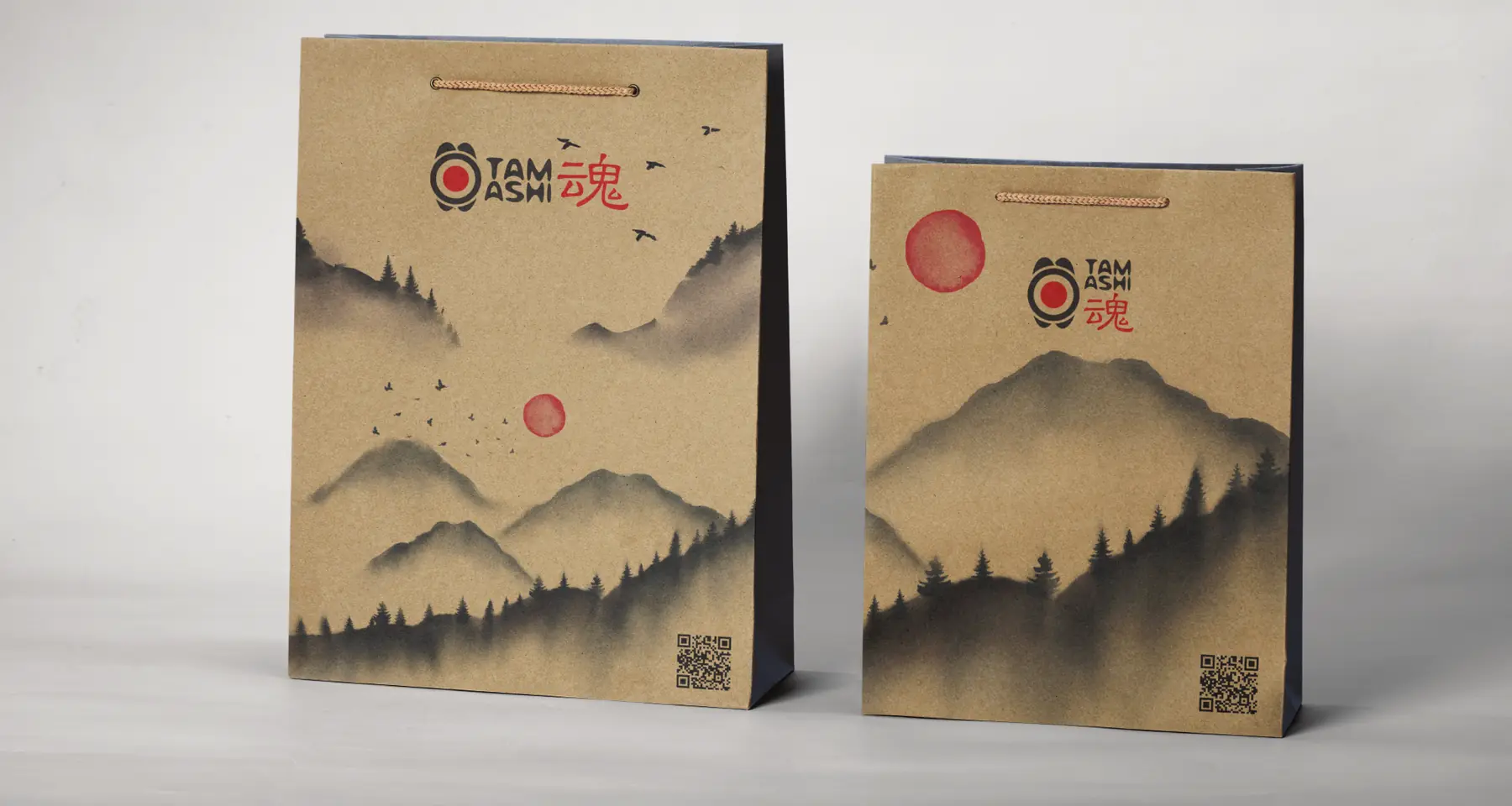
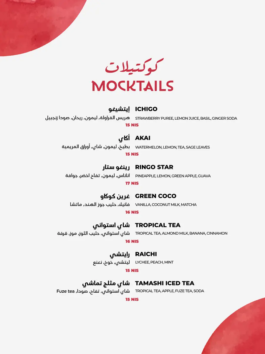
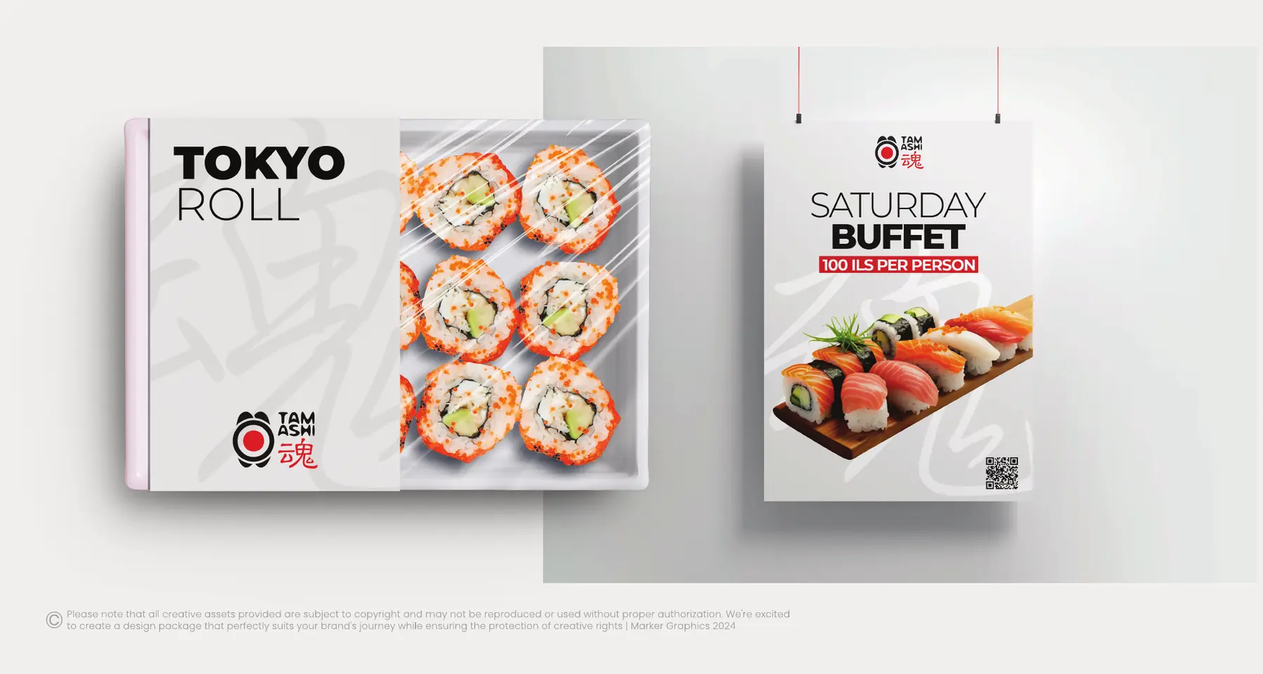
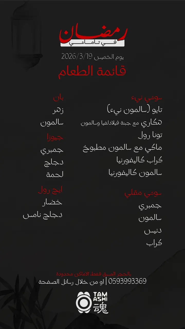
Menus, bags, cards and the table.






Identity by Marker Studio®
What we made
- Rebrand
- Menus
- Bags & packaging
- Stationery
- Social media

 Gardenia